INTERTECH-IKA, a player in the cookie machine industry, gave me freedom to refresh their branding. Their only rule? The new visual identity had to reflect the old one. I worked hard to meet that request while crafting a fresh, modern, and attention-grabbing look.
Visual identity elements
Colour palette
In the past, the company relied on blue and orange as its signature colours. I chose to preserve these hues, adjusting their shades to create a sharper, more striking appearance. Alongside the primary colours—Dark Blue and Pumpkin Orange—I introduced Electric Blue as a vibrant accent. To round out the palette, I selected Ghost White as a secondary color, complemented by Pure White and Black. While crafting this scheme, I prioritized web accessibility, ensuring the colours contrast effectively with one another to enhance readability and visual appeal.
Typography
INTERTECH-IKA’s visual identity is built around the typeface Inter, which is an open-source font perfect for websites. It has a modern style that feels fresh and up-to-date, and its clear, simple design makes it really easy to read on screens. This font pairs nicely with Industry Ultra, the boldest font of the Industry typeface family, used in the logo. Together, they create a strong, consistent look that ties everything together well.
Logo
The design links back to the old logo and brings to mind machine parts. The circles add a modern touch. The typeface used in the visual identity is Industry Ultra, which has a technical vibe that fits the company’s brand perfectly.
Favicon & Logo animation
Along with the original logo, I also made a favicon and a short animation for the email signature. I kept the logo animation file light to make sure it works well and loads easily in emails.

Favicon

Animation
Brochure
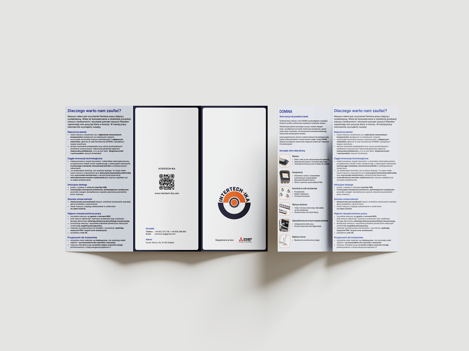
The brochure was designed to highlight the company’s offerings at the fair. Working from the previous version, I refined the copy. The challenging part was incorporating all the details INTERTECH-IKA requested into the design while ensuring it remained visually appealing and engaging.

Brochure

Brochure's inner side
Website
The final piece of this project was redesigning the client’s website. Using the old version as a starting point, I reorganized the content into fewer pages, aiming for a clean, intuitive design that makes it effortless for visitors to find what they need.
